Web
Typography
A Brief History
In his presentation titled “Universal Typography,” Adobe Typekit manager Tim Brown stated: “The web is the best place for text. Unlike a printed artifact, text at a URL can be searched, copied, translated, linked to other documents. It can be printed. It’s convenient. It’s accessible.” (Brown 2014) Since the invention of the Internet, text has always played a major role on the web. In its two and a half decades of existence—the web celebrated its twenty-fifth anniversary in March of this year—the web has revolutionized our daily communication, interaction and business transaction, but the true transformation of typography to the web only took off in the last few years. For the first twenty years, the web had gone through many changes such as adopting web standards, using CSS for layouts instead of tables, and focusing on content strategy and user-centered design. Even though the web embraced text from the beginning, they were not well integrated together for quite some time.
The First Web Site
On December 12, 1990, web inventor Tim Berners-Lee published the first web site ever on the Internet after he figured out the basic concept of the web including Uniform Resource Locator (URL), Hypertext Transfer Protocol (HTTP), and Hypertext Markup Language (HTML). He also created the browser and wrote the software to run the web server. The project Berners-Lee launched was about the World Wide Web, in which he defined, “a wide-area hypermedia information retrieval initiative aiming to give universal access to a large universe of documents.” (Berners-Lee 1990) The site has nothing but texts and links to other documents. As a result, the site still works today as it did when the project was first published twenty-five years ago, which is impressive, despite the changes and advancement in web technologies.
Type on Screen
In the mid-1990s, type designer Matthew Carter gave birth to Georgia and Verdana, two widely used typefaces for screen-based media. Commissioned by Microsoft specifically for texts on web pages, both of these typefaces were designed first in bitmaps (to match the pixels of the screen resolutions at the time) and then translated into outline fonts. To make texts legible and readable on screen, Carter had meticulously designed these fonts with large x-height, open aperture and generous space. In addition to Georgia and Verdana, the web could only display system fonts such as Arial, Helvetica and Times New Roman, which are available on all computers.
Image as Text
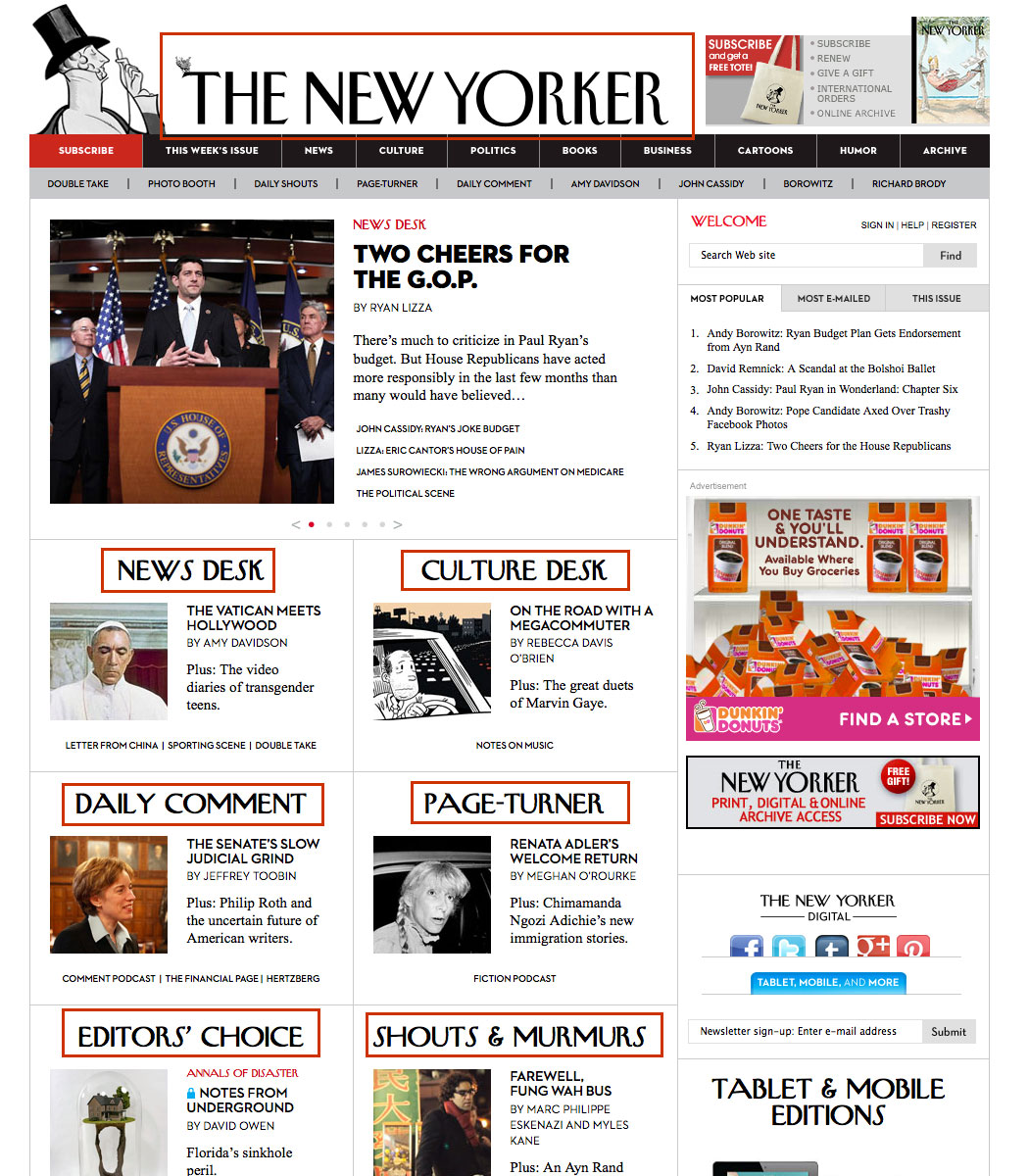
As graphic design was making the transition to the web from mid-1990s to mid-2000s, designers wanted to use more typefaces than just the handful that come with the system fonts. The simplest alternative was to use image as text. One of the advantages of using this method is that designers didn’t have deal with font licensing. Designers could use any typefaces available on their computer, but the downside was that each piece of text had to be sliced up individually in tools like Photoshop or Fireworks. One popular site that used images as texts was the New Yorker. To be consistent with its printed publication, each headline on the New Yorker web site served up images as texts in order to use NY Vogue Goat as its branded typeface. Until November 2010 when the publication started using Typekit to serve its custom fonts, someone’s job at the New Yorker was simply to slice up those images all day long.
Image Replacement Techniques
A major issue of using image as type was that text was not searchable, selectable, or translatable. To get around that problem, web practitioners came up with various image replacement techniques to fill the void. In April 2004, web designer and developer Shaun Inman developed a technique called Scalable Inman Flash Replacement (sIFR) to embed custom fonts in a small Flash movie. He also used JavaScript and CSS to make the text selectable.
While sIFR solved the issue of image slicing, its main drawback was relying on Flash, an Adobe’s proprietary software program for delivering rich contents on the web. Furthermore, setting up sIFR required some web knowledge. In April 2009, system engineer Simo Kinnunen created a new and improved technique called Cufón (Scalable Vector Graphics, SVG). Cufón used JavaScript to render generated fonts (SVG format) to the browser. This technique was easier to set up and did not rely on Flash. Although many image replacement techniques have continued to be developed and advanced over the years—CSS image replacement is still in use today for logo on web sites—they are not genuine web typography.
Web Fonts
Web typography is not a new concept. In 1998, the Cascading Style Sheet (CSS) Working Group proposed the support of the @font-face rule to allow any typeface to be displayed on web pages. Internet Explorer 4 was the first browser to implement it, but with no success. The proposal had no piracy protection or licensing agreement in place. As a result, @font-face was stalled for almost a decade.
In 2008, @font-face made a comeback when Apple Safari and Mozilla Firefox implemented the rule. In May 2009, Jeffrey Veen introduced Typekit, a type hosting service that let designers use high-quality fonts on web sites with the ease of implementation and the worry-free of licensing and cross-browser compatibility. In just two years, Adobe acquired Typekit bringing more classic types such as Garamond Pro, Minion Pro, and Myriad Pro to the web.
In 2010, Google launched its own library of fonts for the world to use for free. As a result, Google only hosts open-source fonts. With its ease of use API (application programming interface), Google has succeeded in making the web more accessible, readable, beautiful and open.
The @font-face rule is now supported on all modern browsers (Internet Explorer, Firefox, Chrome, Safari, and Opera) and mobile browsers (iOS Safari, Android, and Chrome, except for Opera Mini). In addition to Typekit and Google Fonts, many foundries, including Font Bureau, Fontdeck, FontShop, Hoefler & Co., and Webtype, began to offer web-font services. In just a few years, web fonts have swept the world of design. With the rise of responsive web design, typography is going through a new transformation like never before. Unlike a printed publication, the flexibility of the web gives designers no control of their work. Whether through smartphones, tablets, laptops or game consoles, they have no idea how their work will be viewed on a user’s device. In order to accommodate the growing number of devices coming to the market continuously, they have to embrace the fluidity of the web and let go of the notion of pixel perfect control. Designing for the unknown could be intimidating, but that also makes web design challenging and exciting. Brown is right in his statement. The web is the best place for accessing text.
Evaluating Types

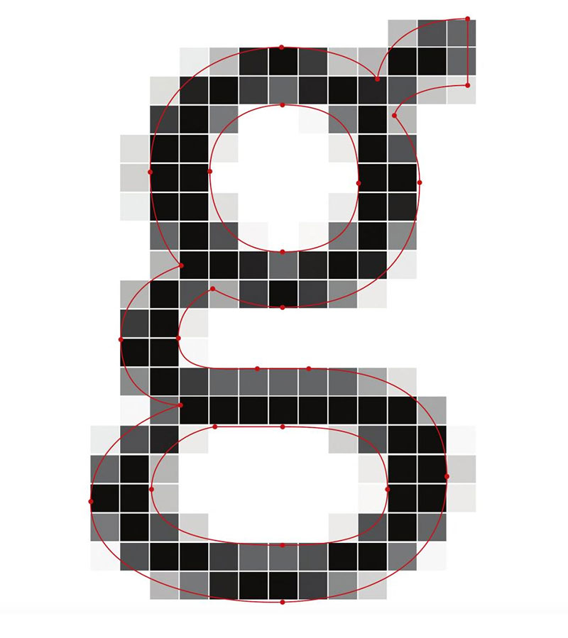
When we read, our eyes move along the lines in a series of brief moments called saccades. As our eyes jump back and forth, we absorb information in between those hops known as fixed periods. The better the reader, the larger the saccades, and the shorter the fixed periods. We read faster if the subject is familiar to us. As we read, we recognize the shapes of the words rather than individual letters; therefore, the strokes and the spaces play a key role in legibility and readability. Particularly with screen resolution, strokes and spaces might disappear at small sizes on devices with low pixel density.
When choosing text typefaces to be read on screens, designers need to consider the following elements: a generous x-height, even spacing, open counters and apertures, prominent ascenders and descenders, and clear stroke joints. Also keep Erik Spiekermann’s advice in mind: “Don’t sacrifice esthetics for practicality. Pick a typeface that has character and strength. Basically, the models which survived 500 years will look good on screens today.” (Spiekermann 2013, 179)

Bibliography
- Brown, Tim. “Universal Typography.” Lecture presented at the SmashingConf, New York, New York, June 18, 2014.
- CERN. 1990. “World Wide Web.” Accessed October 27, 2014.
- Franz, Laura. 2012. Typographic Web Design: How to Think Like a Typographer in HTML and CSS. West Sussex: John Wiley & Sons.
- Hochuli, Jost. 2008. Detail in Typography. London: Hyphen.
- Lupton, Ellen, edit. 2014. Type on Screen: A Critical Guide for Designers, Writers, Developers, and Students. New York: Princeton Architectural.
- Santa Maria, Jason. 2014. On Web Typography. New York: A Book Apart.
- Spiekermann, Erik. 2013. Stop Stealing Sheep and Find Out How Type Works, Third Edition. San Francisco: Adobe.
- Typekit. 2010. “Bring Your Own Fonts to Typekit.” Accessed October 27, 2014.